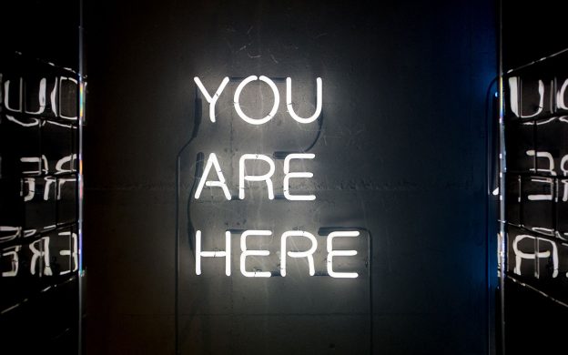
Think about the last time you visited a large department store, looking for a specific item. As you walked in, the first place you probably looked is the directory on the wall. It’s the same with your website.
The most important part of your website is the navigation menu. This is the primary way your visitors will navigate your website, so making sure it’s easy to use is critical.
Why is this important? Well, most website visitors have limited time, limited patience, and a short attention span. If they can’t find what they’re looking for quickly, they will leave your site and go elsewhere.
So here are 10 tips for a perfect navigation menu that will help improve your website’s usability.
1. You should only have one navigation menu.
Having more than one will look messy and more importantly, it will be confusing.
2. Try not to “be different” for the sake of it.
We were recently asked to try a vertical menu, placed on the right-hand side of the page, in order to stand out from other websites.
Distinguishing yourself from your competitors is essential in marketing, but your website’s navigation is not the way to do this. Users expect a certain layout, and will not stay on your website if they can’t find what they want quickly.
3. The ideal navigation menu should be horizontal.
We’re not opposed to vertical menus. But website visitors will expect a horizontal menu, and you want to make things as easy and intuitive as possible.
4. Make it stand out.
The navigation menu should stand out from the rest of the page, while still working with the overall colour scheme.
5. Try not to have more than seven menu items.
People like to move fast while on the web. If they are faced with 10 or more menu options, they will have to read them all first to find what they’re looking for. You want a menu that users can process with a fast scan of the page. If you can trim seven down to six or five, even better.
6. Organise links in a hierarchical structure.
If you have lots of menu items, the best way to achieve a clear structure is with drop-down menus. This allows website users to process large amounts of information quickly by breaking it down into smaller chunks.
Some website developers aren’t big fans of drop-down menus, saying they can be frustrating for users and possibly harder for Google to ‘crawl’ (see our blog post on SEO for an explanation of this). But if you have a lot of website content to point to, the best option is to use drop-downs.
7. Never go more than three levels deep.
One of the rules of website usability design is to have all the information available within three clicks from the homepage.
If you bury a piece of information under a multitude of pages, not only will you make it difficult to find, but your visitors are unlikely to dig deeper than three clicks to reach it.
8. Use descriptive titles in your navigation menu.
The language you use in your menu should be natural and easy to understand. For example, the menu item “Team” can be changed to “Meet Our Team”, so the user knows exactly what to expect when they visit this page.
This is not just helpful for users. With more descriptive menu items, Google bots can better understand your page as they crawl through the website reading its content. So think first about the words your customers are looking for, and secondly, think of Google and search engine optimisation.
9. Think about the order of your navigation items.
Order matters in website navigation. User experience studies have shown that website visitors tend to remember links on either end of the navigation most vividly. So put your most important items at the beginning of the navigation and the least important items in the middle. “Contact” should be the last item on the list, putting it at the far right in top-level horizontal navigation - a standard location.
10. Your logo should always navigate to the home page.
This isn’t strictly related to your navigation menu but we think it’s worth mentioning. A common mistake is to have your logo exist merely as an image on the homepage. Visitors generally expect to be taken back to the homepage when they click on a company logo, so make sure yours does this.